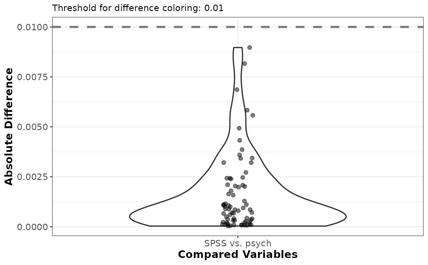
Plot method for the efa_compare() function showing the distribution of the
absolute differences between the two compared objects as a violin plot with
jittered points. Differences above the threshold are highlighted.
Usage
# S3 method for class 'efa_compare'
plot(x, plot_red = NULL, ...)
Arguments
- x
list. An object of class
efa_compare(output from theefa_compare()function).- plot_red
numeric or
NULL. Threshold above which to draw the absolute differences in red, documented inefa_compare().NULL(default) uses the value recorded inx$settings; supplying one overrides it for this plot only, so the comparison need not be recomputed to redraw it at another threshold.- ...
not used.
Value
A ggplot object showing the absolute differences, with differences
above plot_red highlighted in red.
Examples
# A type SPSS EFA to mimick the SPSS implementation
EFA_SPSS_5 <- efa_fit(IDS2_R, n_factors = 5,
                      estimate_control = estimate_control(type = "SPSS"),
                      rotate_control = rotate_control(type = "SPSS"))
#> Warning: `N` is "NA"; not all fit indices could be computed.
#> ℹ Provide `N` or raw data to compute all fit indices.
#> Warning: Reached the maximum number of iterations without convergence; results may not
#> be interpretable.
#> Warning: Only the "promax" and "varimax" rotations are validated against the SPSS
#> implementation.
#> ℹ "oblimin" results may differ from those returned by SPSS.

# A type psych EFA to mimick the psych::fa() implementation
EFA_psych_5 <- efa_fit(IDS2_R, n_factors = 5,
                       estimate_control = estimate_control(type = "psych"),
                       rotate_control = rotate_control(type = "psych"))
#> Warning: `N` is "NA"; not all fit indices could be computed.
#> ℹ Provide `N` or raw data to compute all fit indices.

# compare the two and plot the differences
comp <- efa_compare(EFA_SPSS_5$unrot_loadings, EFA_psych_5$unrot_loadings,
                    x_labels = c("SPSS", "psych"))
plot(comp)